Loading
...
...
One of our more well-known projects at Neo was executed by myself and my colleague Nicole.
AskAlexis is an SMS-based service primarily used by men where the "Alexis" personality answers questions about dating, romance, grooming, etc.
Using Rails and my own CSS library, Kickstart, we quickly built a single landing page with the invitation to sign up with just a phone number.
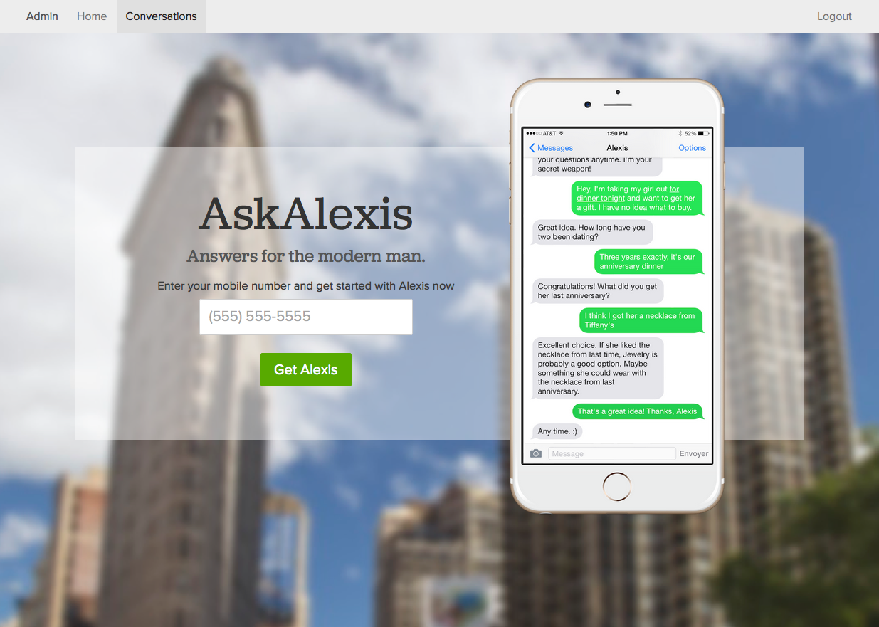
(Above) AskAlexis, latest homepage screenshot, (Below) AskAlexis, early homepage screenshot.
Meanwhile, I set to work quickly building a makeshift backend where we could organize and respond to messages coming in.
Usually we roll this sort of thing out to a few users, just to get a bit of learning before investing too much work into it.
We hadn't anticipated on it going viral.
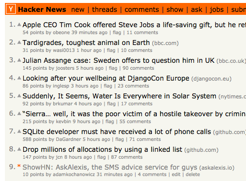
On the day we launched, AskAlexis blasted its way to the front page of HackerNews, ProductHunt, and a week later in a top story on CNet.
Needless to say, we got to work. Nicole and I broke a sweat engaging users through lunch, the workday, late into the night and on weekends, just to keep our momentum going.
Interestingly, by keeping our initial product very light and flexible, I was able to integrate features concurrently to our discovering we needed them.
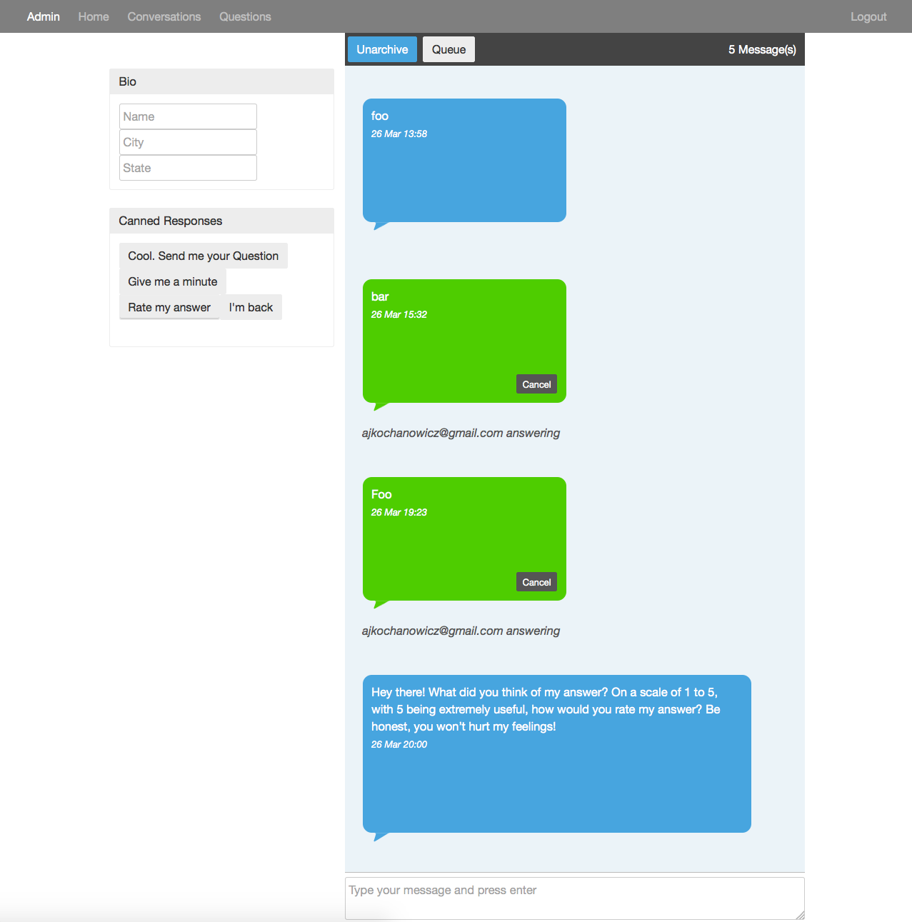
In the first 24 hours, we learned that we were saying the same things to a lot of people when starting conversations. I wrote some quick throwaway JavaScript that let us choose from a list of canned responses to send off to users.
We also learned a lot of users were asking questions that could easily be answered on Yelp. I added a single text box that took a location string. Pressing enter took us immediately to dining results in that area on Yelp. Taking out just a few steps made our workflow surprisingly efficient.
The flexibility of reusable components from ReactJS let me make chunks of the interface and repeat them throughout (e.g. multiple Canned Response buttons). Rails's easy migrations and database manipulation allowed us to move conversations through different states, much the same way you might organize your email inbox.
At the time of this writing, there's not much more to say on Alexis. We've recently hired some staff members to give Nicole and I a break and we're looking forward to seeing where it goes.
Design
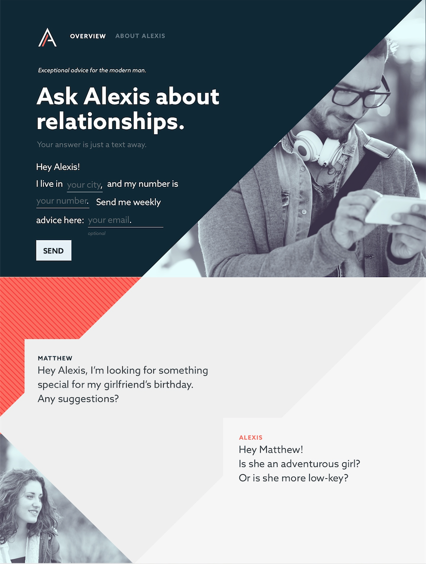
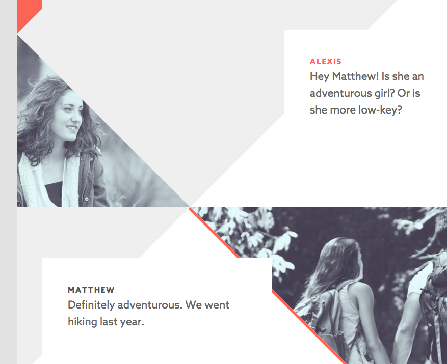
Our designer, Christine, took great strides in evolving our temporary design into a storyboarded experience for users to get an holistic understanding of how the product worked. One of the more remarkable characteristics of this design was the triangular zig-zagging of colors and photos that elegantly weaved into the hypothetical conversation of our Alexis and Matthew, a user.
The AskAlexis home page is one of the most complicated I've had to build. The design required the triangular and rectangular shapes tilted at 45 degree angles and perfectly touched corners with one another.
If the slant or spacing of any object was off by just one pixel, the whole flows of the zig-zagging design would be thrown off and disjointed. If it wasn't perfect, the flaw would amplify and become easily noticeable.
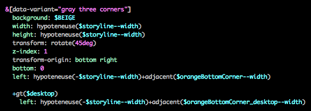
Honestly, I could have made this easier for myself by creating SVGs and forcing points to align on the drawing board. However, it becomes quickly evident just how involved it is to make the SVGs responsive as well.
The other advantage to calculating these components in squares and golden rectangles is that the alignment of all the "artifacts" carry down from a single measurement from which all other measurements are derived.
This proved useful when we wanted to create a desktop version with wider panels once the tablet version had already been completed.